
EAST COAST/WEST COAST PSYCHEDELIC POSTERS from the collection of Keith Murgatroyd.
Keith Murgatroyd (1927-2005)
was a distinguished typographer, a member of both the Society of Typographic Designers and of the Chartered Society of Designers.
In 1969, Keith made a book, Modern Graphics, for Studio Vista. The book became an art-school and professional classic.
In preparation for the book Keith Murgatroyd had researched and collected posters from America, from across both eastern and
west coast seaboards, from Japan also, and from Switzerland.
Keith was especially interested, like the designer Tom Eckersley,
in the potential of photo-mechanical screen-printing to provide short-run communications for groups hitherto excluded from
mainstream media. His collection of posters from the USA, Switzerland, and Japan reveal the precision and complexity of this
multi-layered process, as it developed during the post-war period and into the 1960s.
The posters Keith chose are testimony to his professional eye and to his interest in the potential of colour, scale, optical disturbance,
and feeling within the established visual language of posters.
In Switzerland, he chose designers working with the basic elements of space and type, as the building blocks of a coherent
and meaningful graphic language.
In Japan, the art effects of optical disturbance were chosen in combination to create a cultural exhibition poster that could
become part of the exhibition…
And in America, designers were using colour and optical disturbance to give form to the various experiments in counter-cultural living.
As a professional designer, Keith was able to appreciate the quality and precision of print culture.
Accordingly, he kept the posters very carefully, laid flat, in his plan-chest and away from direct sunlight.
The posters are in A+ condition.
We are proud to acknowledge and remember the design talent Keith Murgatroyd and to offer these important posters for sale.
Communication Design and Counter-Culture
The 1960s were a decade of social change across the world. This was both a natural consequence of post-war rebuilding
and economic prosperity, and also a consequence of the emergence of a distinct and different form of youthful counter-culture.
The 1960s counter-culture has its origins in the dissenting traditions of the beat movement and the university campus.
The massive expansion of the public university, across the world, promoted the emergence of a social-science driven critique
of the “adult” status quo.
In the US, the politics of dissent addressed issues as diverse as civil rights, anti-psychiatry, environmentalism and of
utopian community building. It was in this context of youthful idealism that screen-printing, image making
and counter-culture, combined to produce a new visual language…of protest and pleasure.
WEST COAST- CALIFORNIA
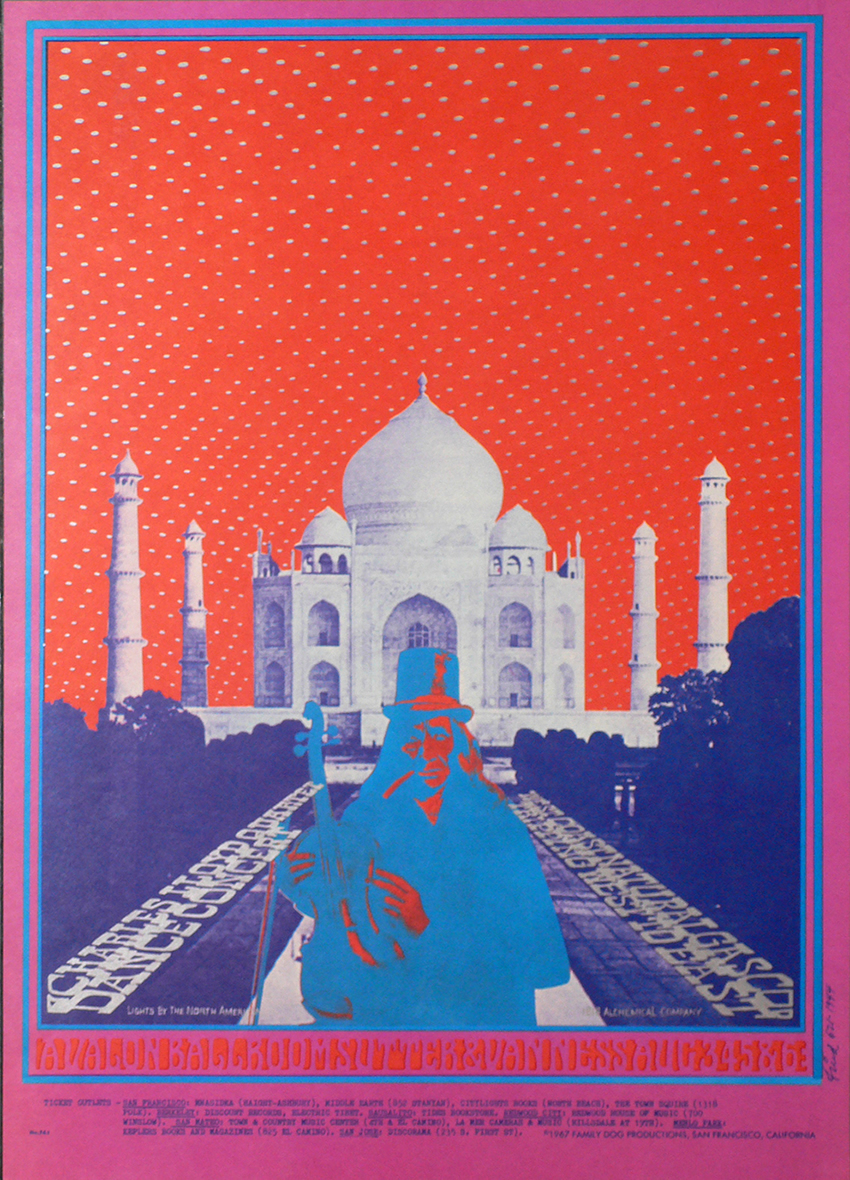
Robert Fried
The poster art created by Robert Fried to promote 1960s and 70s live music concerts, club dates and legendary events is well known.
The Family Dog Numbered Series includes 147 numbered posters that advertised Family Dog shows—primarily at the Avalon Ballroom
in San Francisco—from 1966 to 1968.
There are also numbered posters for shows produced by the Family Dog in Denver and Portland. The Family Dog Series
includes both posters and handbills. Later in the Series, there were postcards and image tickets. Family Dog was
the production company run by Chet Helms.
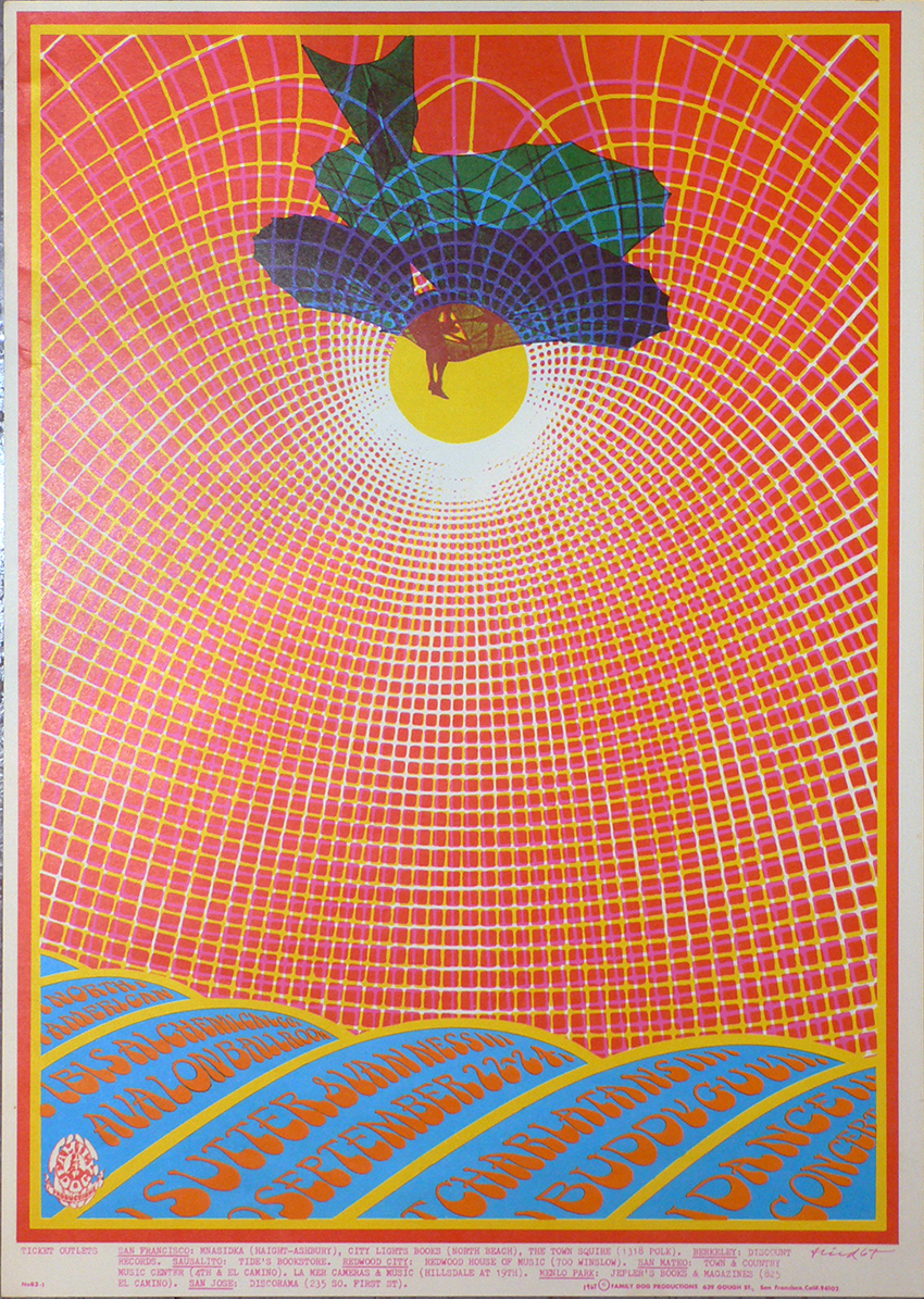
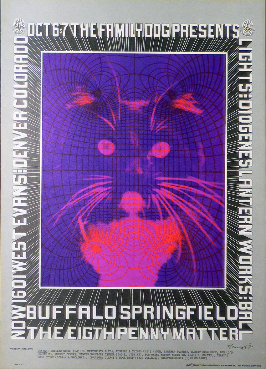
FD71 Charlatans 1967
FD74 Avalon Ballroom 1967
FD83 Dance Concert 1967
FD Denver 5 Buffalo Springfield 1967
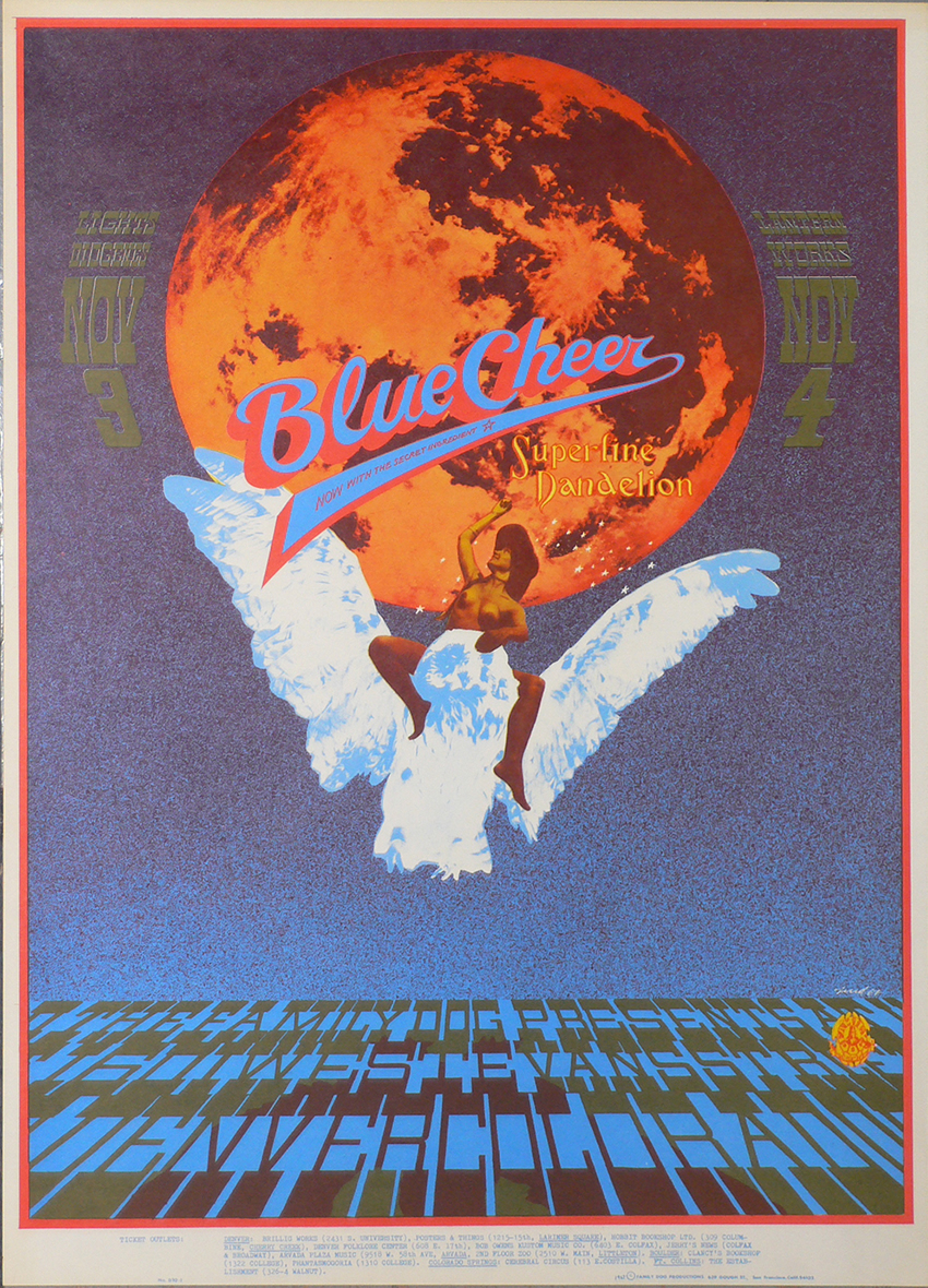
FD Denver 10 Blue Cheer 1967
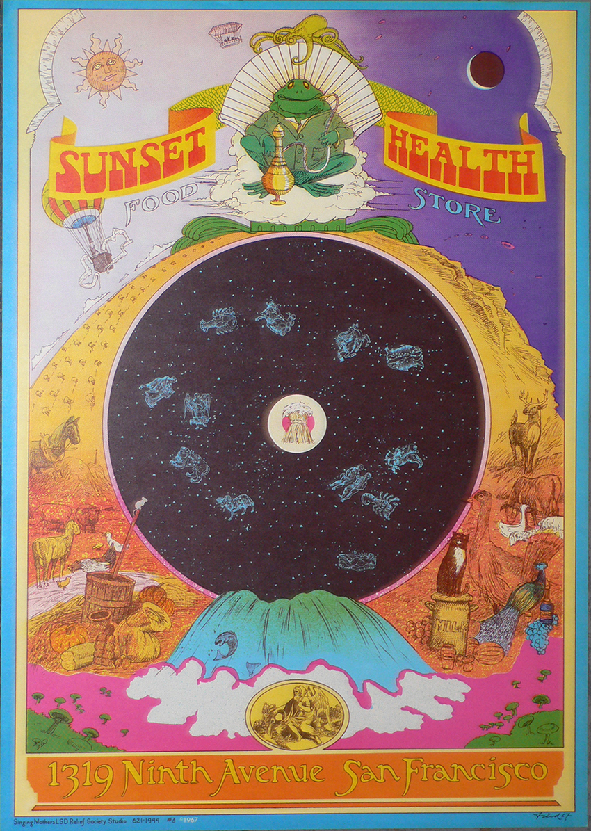
Sunset Health Food Store Singing Mothers LSD Relief Society Studio 1967
Rick Griffin
He travelled with Ida on a Mexican surfing trip and later planned a move to San Fransisco after seeing various psychedelic
rock posters. In late 1966, the couple arrived in San Francisco, where they first lived in their van before moving to Elsie Street.
In the mid-1960s, he participated in Ken Kasey’s Acid Tests. His first art exhibition was for the Jook Savages,
celebrating the one-year anniversary of the Psychedelic Shop. Chet Helms was impressed by Griffin's work and asked him
to design posters for the Family Dog dance concerts, which led Griffin to create concert posters.
In 1967, Griffin, Kelley, Mouse, Victor Moscoso and Wes Wilson teamed as the founders of Berkeley Bonaparte, a company
that created and marketed psychedelic posters. Griffin returned to Southern California in 1969.
MSO ZZZ Head Shop poster 1967
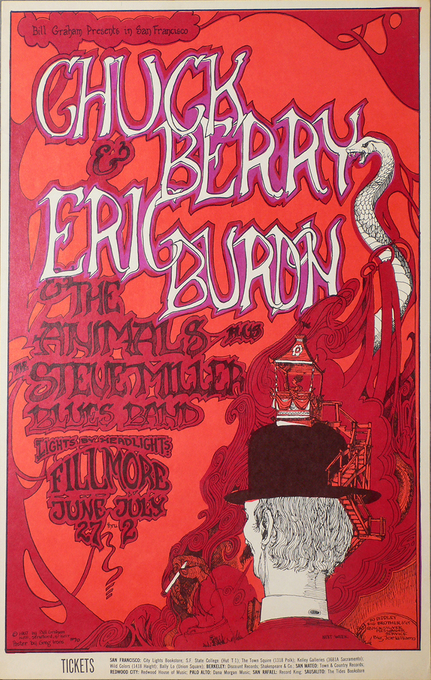
Greg Irons
The poster art created by Greg Irons to promote 1960s and 70s live music concerts, club dates and legendary events is well known.
Greg Irons (September 29, 1947 – November 14, 1984) was a poster artist, underground cartoonist, animator and tattoo artist.
Born in Philadelphia, Pennsylvania, he moved to San Francisco, California, in 1967, where he soon found work doing posters
for Bill Graham at The Fillmore Auditorium. After working on the film Yellow Submarine, he returned to work for Graham Productions
and soon branched out into album covers and comix work for the Print Mint, Last Gasp Eco-Funnies, and other local underground
publishers. On November 14, 1984, while on a working vacation in Bangkok, Thailand, Irons was struck and killed by a bus.
BG70 Chuck Berry 1967
Mounted with hinges onto card
Victor Moscoso
Victor Moscoso was the first of San Francisco’s “Big Five” psychedelic poster artists to have his work shown in the
Museum of Modern Art in New York. Moscoso pioneered the use of vibrating colors to create the ‘psychedelic’ effect in poster art.
His work is in the Victoria and Albert Museum in London and in the Library of Congress. His Neon Rose series of posters is one
of the crown jewels of the psychedelic poster era. Born in Spain in 1936, Victor Moscoso was brought up in Brooklyn, New York,
where he studied art at Cooper Union Art School before attending Yale University School of Art. At Yale, he studied with the modern
colorist Joseph Albers, whose color theories were an important influence on Moscoso and on the development of the
psychedelic poster. Moscoso moved west in1959 to attend the San Francisco Art Institute, where he later received his MFA.
After graduation, he remained at the Art Institute, where he taught lithography and built a career as a freelance graphic designer.
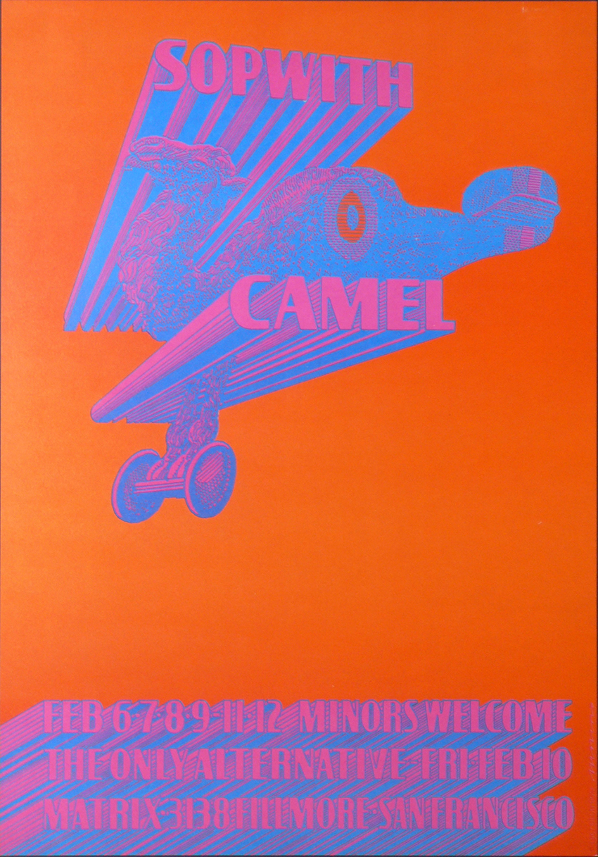
Sopwith Camel
Sopwith Camel's live performances are presented in the concert posters, handbills, and other memorabilia.
The original poster was printed on white index stock and measures approximately 14″ x 20″.
This poster has the credit “c 1967 Neon Rose Moscoso” in the lower right margin.
NR5 Matrix 2 - Sopwith Camel 1967
Mounted with hinges on card
© Bill Graham Archives, LLC. All Rights Reserved
Wes Wilson
Wes Wilson is generally acknowledged as the father of the 60s rock concert poster.
In 1968, he received an award from the National Endowment for the Arts for “his contributions to American Art.”
He pioneered what is now known as the psychedelic poster. Wilson grew up more interested in nature and the outdoors than in art.
He studied forestry and horticulture at a junior college in Auburn, California, then attended San Francisco State, where his major
was philosophy. After college, Wilson joined Bob Carr, whose basement print shop was known as Contact Printing.
As Carr’s assistant and partner, Wes Wilson did the basic layout and design for most of the work Carr brought in through contacts
in San Francisco’s North Beach coffeehouse poetry and jazz club scene.
In 1965, Contact Printing was well-positioned to serve San Francisco’s burgeoning counterculture. It produced handbills for the
San Francisco Mime Troupe fundraising benefits, the so-called ‘Appeal’ parties, as well as for the Merry Prankster Acid Tests.
Both were linked to the newly reborn dance-hall venues through a series of benefit concerts, so it is no surprise that the dance-hall
promoters soon found their way to the Contact press. Wes Wilson’s first poster was self-published. Done in 1965, it features a
swastika within an American flag motif, a protest by Wilson to the ever-increasing U.S. involvement in the Vietnam War.
Wilson designed the handbill for the Trips Festival. He attended the event and was deeply moved by what he saw and experienced.
Wes Wilson had also been doing the posters for promoter Chet Helms’ shows at the Straight Theatre. It was Wilson who designed
the original logo for the Family Dog and who did the posters for the brief series of Family Dog shows at the Fillmore Auditorium,
and then for the first series of Family Dog shows at the Avalon Ballroom. Soon he was doing that work plus doing the posters for
Bill Graham’s shows at the Fillmore. After several months, Wilson stopped producing for the Family Dog venue and
concentrated almost exclusively on posters for Bill Graham’s Fillmore events. He cites that with Chet Helms
and the Avalon Ballroom, he was often given a theme around which he was asked to improvise, while with Bill Graham
and the Fillmore, he was given complete freedom to design whatever he wanted. Wilson enjoyed the added artistic freedom.
FD5 Avalon Ballroom The Blues Project 1976
Handbill printed in color.
These handbills were made to be inserted in magazines and are all folded in half by the printer. Mounted on hinges to card.
This design is from the first Family Dog show held at the Avalon Ballroom, and is known as “Blues Project.”
The central image is a photograph of a Native American wearing a top hat and smoking what appears to be a joint.
At the bottom of the photo are the words “May the Baby Jesus Shut Your Mouth and Open Your Mind”.
This same image also appears in the Family Dog logo.


EAST COAST - NYC
Push Pin Studios
After graduating at the Cooper Union in New York City, Reynold Ruffins, Seymour Chwast, Edward Sorel and Glaser, founded Push Pin
Studios in 1954. Glaser joined after his return in Italy. In 1957, the "Push Pin Monthly Graphic," was sent out to friends and clients.
They rejected tradition and favored “reinvigorated interpretations of historical styles.” The studio “redefined and expanded the
imprimatur of the designer, illustrator,and visual culture at large.”
Push Pin Graphic Series
Published monthly and was available,
by post and rail, on subscription, each printed on reverse with editorial notes and publisher’s details.
Seymour Chwast
Seymour Chwast (born August 18, 1931) is an American graphic designer, illustrator, and type designer.
Chwast was born in Bronx, New York, and graduated with a Bachelor of Fine Arts from Cooper Union in 1951.
With Milton Glaser, Edward Sorel, and Reynold Ruffins, he founded Push Pin Studios in 1954.
The bi-monthly publication The Push Pin Graphic was a product of their collaboration. Chwast is famous for his commercial
artwork, which includes posters, food packaging, magazine covers, and publicity art. Often referred to as
"the left-handed designer,"Chwast's unique graphic design melded social commentary and a distinctive style of illustration.
Today, he continues to work and is principal at The Pushpin Group, Inc. in New York City. In 1979, he was hired by McDonald's
to design on the first box for their Happy Meals. Chwast married designer Paula Scher in 1973
and divorced five years later. They remarried in 1989.
Dante’s Inferno - The End Place (Canto XVIII)
18x28
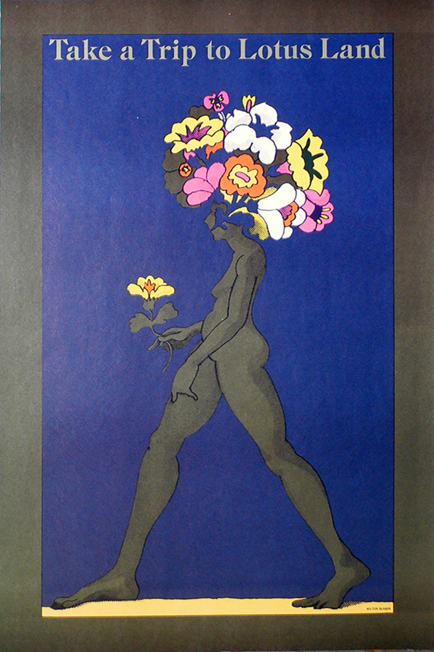
Milton Glaser
Milton Glaser (born June 26, 1929 - 2020) , American graphic designer. His designs include the I ❤ NY logo,
the psychedelic Bob Dylan poster, and the Brooklyn Brewery logo.[2]
In 1954, he also co-founded Push Pin Studios, founded New York Magazine with Clay Felker,
and established Milton Glaser, Inc. in 1974. His artwork has been featured in exhibits, and placed
in permanent collections in many museums worldwide. Throughout his long career, he has designed
many posters, publications and architectural designs. He has received many awards for his work,
including the National Medal of the Arts award from President Barack Obama in 2009. He was the first
graphic designer to receive this award.
Glaser was born in New York City to Hungarian Jewish immigrants. He attended The High School of Music & Art,
and graduated from Cooper Union in New York City. By a Fulbright scholarship, he also studied graphic design at the
Academy of Fine Arts in Bologna, Italy. 1954 he co-founded Push Pin Studios, along with fellow Cooper grads
Edward Sorel, Seymour Chwast, and Reynold Ruffins. Glaser and Chwast directed Push Pin for twenty years,
while it became a guiding reference in the world of graphic design.
In 1983, Glaser teamed up with Walter Bernard and started a publication design firm called WBMG in New York City.
WBMG has designed more than 50 magazines, newspapers and periodicals around the world.
Over his career,
Glaser has personally designed and illustrated more than 300 posters.
His work is displayed in the Cooper Hewitt National Design Museum, New York; the Victoria and Albert Museum, London
and the Israel Museum, Jerusalem.
His work has also been featured in exhibits all over the world. He has also done one-man shows at the
Centre Georges Pompidou in Paris and the Museum of Modern Art in New York City.
Take a Trip to Lotus Land
18x28
James McMullan
James McMullan (born June 1934) is an illustrator and designer of theatrical posters.
Born in Tsingtao, Republic of China (1912–49),
where his grandparents had emigrated from Ireland as missionaries for the Anglican Church, he and his mother fled to Canada
at the onset of World War II. In 1944, he enrolled at St. Paul's Boarding School in Darjeeling, India.
After his father was killed in a plane crash, he joined his mother in Shanghai, and the two relocated to Vancouver Island,
where he completed his high school education. When McMullan was 17, he and his mother emigrated to the United States,
where he studied for a year at the Cornish College of the Arts in Seattle. He joined the United States Army and served at Fort Bragg
in North Carolina, where he drew diagrams of where to position propaganda loudspeakers on Sherman tanks.
In 1955, McMullan moved to New York City to continue his art education at Pratt Institute. While studying there he supported himself by
illustrating book jackets for authors such as Lawrence Durrell and Jorge Luis Borges. He also did magazine illustrations for Esquire
and Sports Illustrated, among others.
In 1969, McMullan joined the fledgling New York Magazine and helped develop its graphic
personality. His most notable contribution to the publication was the artwork illustrating the story about a Brooklyn discotheque
that served as the basis for Saturday Night Fever.
McMullan's first theatrical poster was for the 1976 production of Comedians, produced by Alexander H. Cohen, who began to
hire him on a regular basis. When Cohen's associate, Bernard Gersten, became Executive Producer of Lincoln Center Theater,
he invited McMullan to join the organization. He eventually created more than forty posters for Lincoln Center productions,
many of which are included in the 1998 book The Theater Posters of James McMullan.
In 1981, McMullan published Revealing Illustrations, in which he candidly discusses his working method.
He is the creator of the "High Focus" method of figure drawing, which he began teaching at the School of Visual Arts in 1987.
He won a Drama Desk Special Award for his consistently inspired artwork for the theater in 1991.
McMullan and his wife Kate Hall have collaborated on six picture books for children.
Head Out to OZ
18x28


